User login
This transcript has been edited for clarity.
Two individuals in the United States are celebrating their 30th birthdays. It’s a good day. They are entering the prime of their lives. One is a married White woman with a university degree. The other is a never-married White man with a high school diploma.
How many more years of life can these two individuals look forward to?
There’s a fairly dramatic difference. The man can expect 37.1 more years of life on average, living to be about 67. The woman can expect to live to age 85. That’s a life-expectancy discrepancy of 18 years based solely on gender, education, and marital status.
I’m using these cases to illustrate the extremes of life expectancy across four key social determinants of health: sex, race, marital status, and education. We all have some sense of how these factors play out in terms of health, but a new study suggests that it’s actually quite a bit more complicated than we thought.
Let me start by acknowledging my own bias here. As a clinical researcher, I sometimes find it hard to appreciate the value of actuarial-type studies that look at life expectancy (or any metric, really) between groups defined by marital status, for example. I’m never quite sure what to do with the conclusion. Married people live longer, the headline says. Okay, but as a doctor, what am I supposed to do about that? Encourage my patients to settle down and commit? Studies showing that women live longer than men or that White people live longer than Black people are also hard for me to incorporate into my practice. These are not easily changeable states.
But studies examining these groups are a reasonable starting point to ask more relevant questions. Why do women live longer than men? Is it behavioral (men take more risks and are less likely to see doctors)? Or is it hormonal (estrogen has a lot of protective effects that testosterone does not)? Or is it something else?
Integrating these social determinants of health into a cohesive story is a bit harder than it might seem, as this study, appearing in BMJ Open, illustrates.
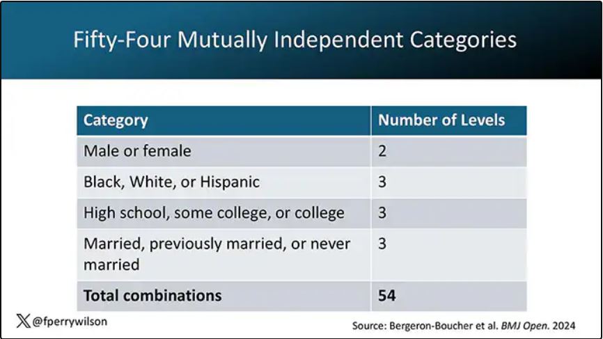
In the context of this study, every person in America can be placed into one of 54 mutually exclusive groups. You can be male or female. You can be Black, White, or Hispanic. You can have a high school diploma or less, an associate degree, or a college degree; and you can be married, previously married, or never married.

Of course, this does not capture the beautiful tapestry that is American life, but let’s give them a pass. They are working with data from the American Community Survey, which contains 8634 people — the statistics would run into trouble with more granular divisions. This survey can be population weighted, so you can scale up the results to reasonably represent the population of the United States.
The survey collected data on the four broad categories of sex, race, education, and marital status and linked those survey results to the Multiple Cause of Death dataset from the CDC. From there, it’s a pretty simple task to rank the 54 categories in order from longest to shortest life expectancy, as you can see here.
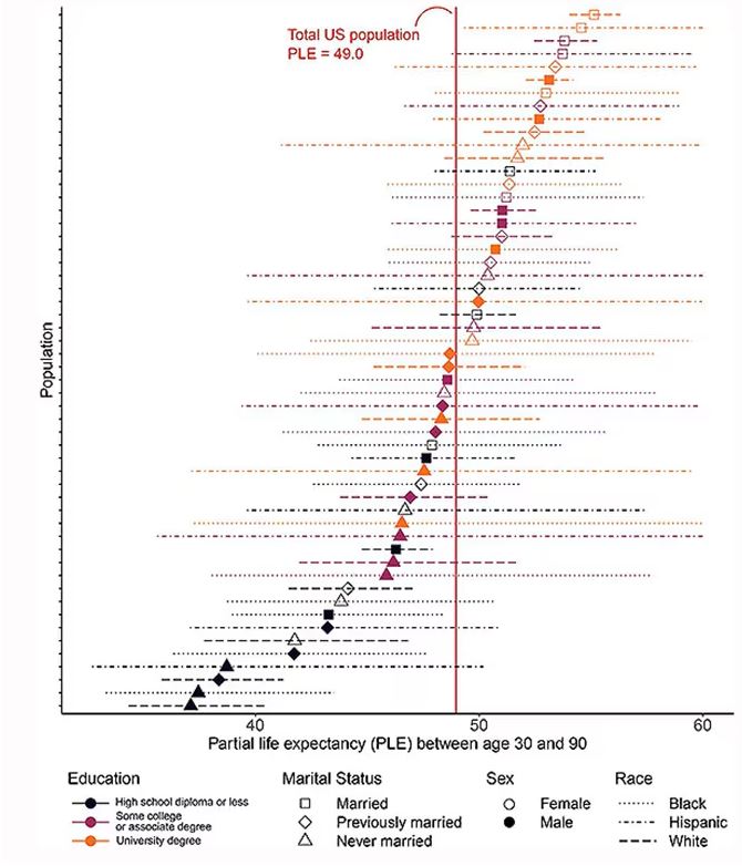
But that’s not really the interesting part of this study. Sure, there is a lot of variation; it’s interesting that these four factors explain about 18 years’ difference in life expectancy in this country. What strikes me here, actually, is the lack of an entirely consistent message across this spectrum.
Let me walk you through the second figure in this paper, because this nicely illustrates the surprising heterogeneity that exists here.
This may seem overwhelming, but basically, shapes that are higher up on the Y-axis represent the groups with longer life expectancy.
You can tell, for example, that shapes that are black in color (groups with high school educations or less) are generally lower. But not universally so. This box represents married, Hispanic females who do quite well in terms of life expectancy, even at that lower educational level.
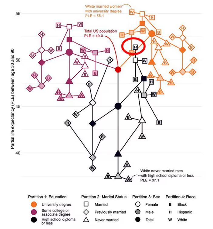
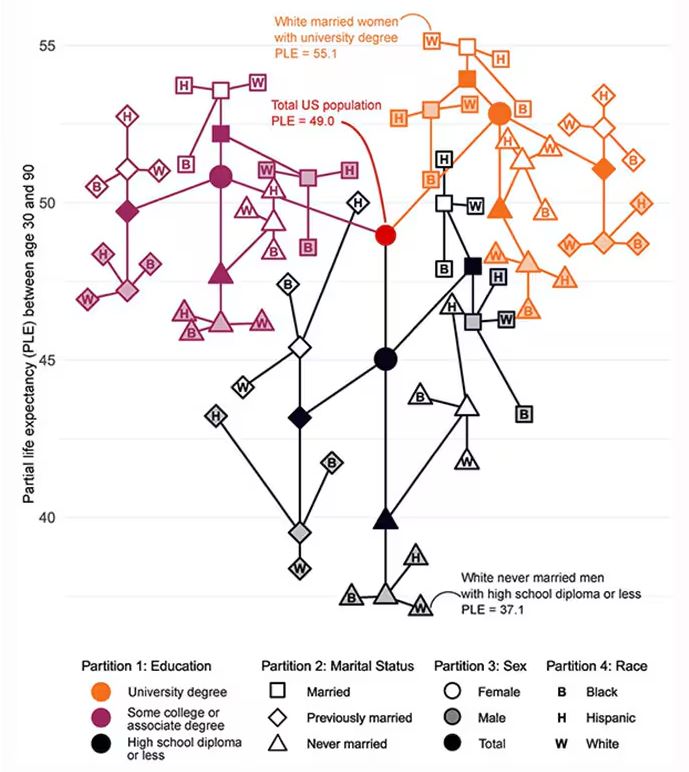
The authors quantify this phenomenon by creating a mortality risk score that integrates these findings. It looks something like this, with 0 being average morality for the United States.
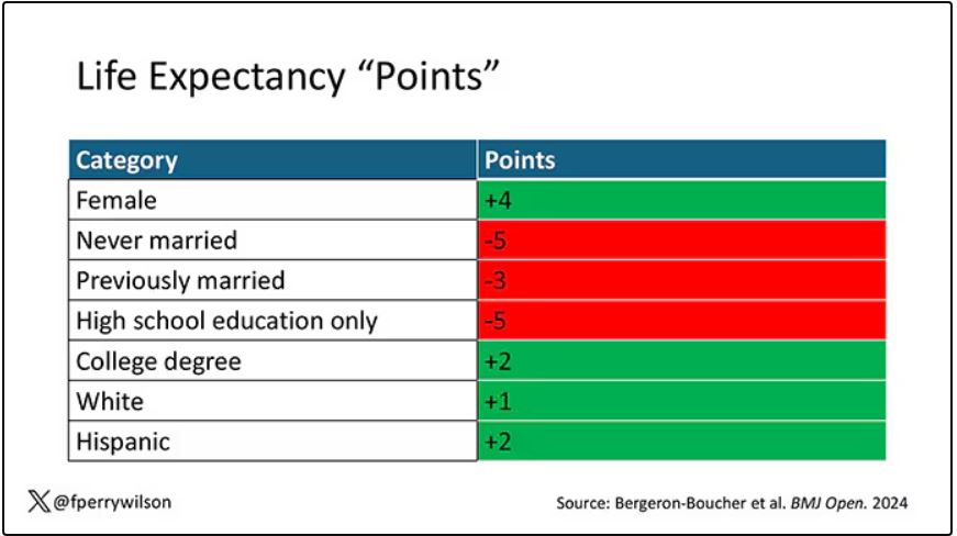
As you can see, you get a bunch of points for being female, but you lose a bunch for not being married. Education plays a large role, with a big hit for those who have a high school diploma or less, and a bonus for those with a college degree. Race plays a relatively more minor role.
This is all very interesting, but as I said at the beginning, this isn’t terribly useful to me as a physician. More important is figuring out why these differences exist. And there are some clues in the study data, particularly when we examine causes of death. This figure ranks those 54 groups again, from the married, White, college-educated females down to the never-married, White, high school–educated males. The boxes show how much more or less likely this group is to die of a given condition than the general population.
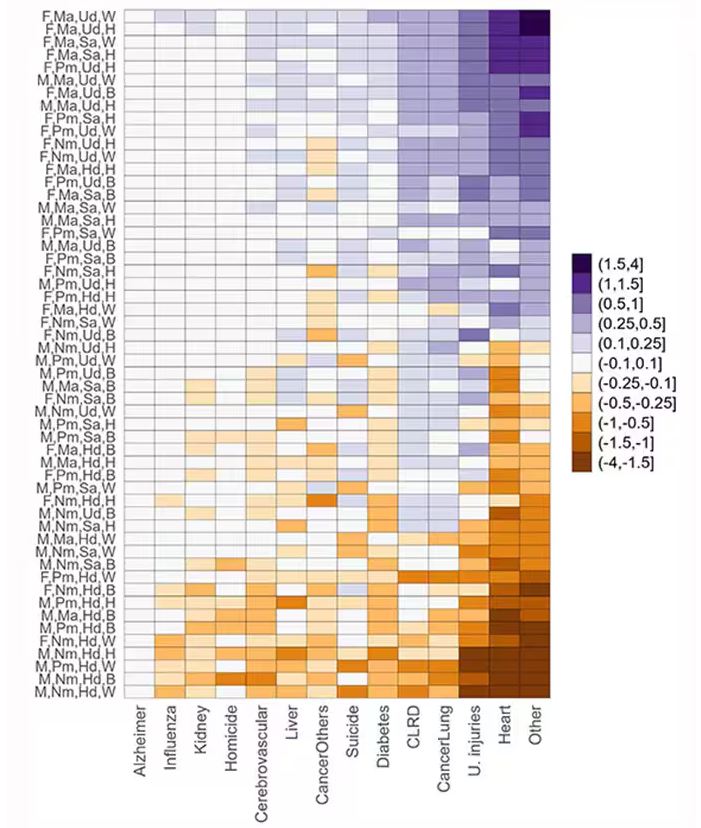
Looking at the bottom groups, you can see a dramatically increased risk for death from unintentional injuries, heart disease, and lung cancer. You see an increased risk for suicide as well. In the upper tiers, the only place where risk seems higher than expected is for the category of “other cancers,” reminding us that many types of cancer do not respect definitions of socioeconomic status.
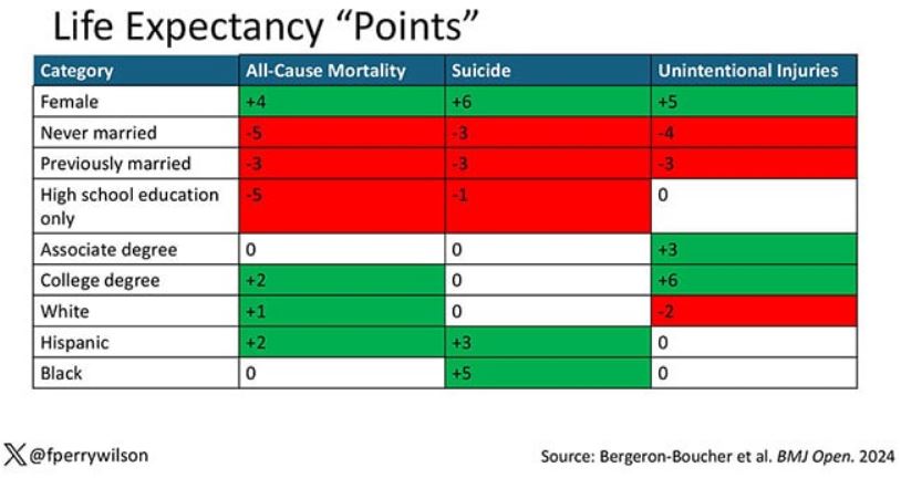
You can even update the risk-scoring system to reflect the risk for different causes of death. You can see here how White people, for example, are at higher risk for death from unintentional injuries relative to other populations, despite having a lower mortality overall.
So maybe, through cause of death, we get a little closer to the answer of why. But this paper is really just a start. Its primary effect should be to surprise us — that in a country as wealthy as the United States, such dramatic variation exists based on factors that, with the exception of sex, I suppose, are not really biological. Which means that to find the why, we may need to turn from physiology to sociology.
Dr. Wilson is associate professor of medicine and public health and director of Yale’s Clinical and Translational Research Accelerator, New Haven, Connecticut. He has disclosed no relevant financial relationships.
A version of this article first appeared on Medscape.com.
This transcript has been edited for clarity.
Two individuals in the United States are celebrating their 30th birthdays. It’s a good day. They are entering the prime of their lives. One is a married White woman with a university degree. The other is a never-married White man with a high school diploma.
How many more years of life can these two individuals look forward to?
There’s a fairly dramatic difference. The man can expect 37.1 more years of life on average, living to be about 67. The woman can expect to live to age 85. That’s a life-expectancy discrepancy of 18 years based solely on gender, education, and marital status.
I’m using these cases to illustrate the extremes of life expectancy across four key social determinants of health: sex, race, marital status, and education. We all have some sense of how these factors play out in terms of health, but a new study suggests that it’s actually quite a bit more complicated than we thought.
Let me start by acknowledging my own bias here. As a clinical researcher, I sometimes find it hard to appreciate the value of actuarial-type studies that look at life expectancy (or any metric, really) between groups defined by marital status, for example. I’m never quite sure what to do with the conclusion. Married people live longer, the headline says. Okay, but as a doctor, what am I supposed to do about that? Encourage my patients to settle down and commit? Studies showing that women live longer than men or that White people live longer than Black people are also hard for me to incorporate into my practice. These are not easily changeable states.
But studies examining these groups are a reasonable starting point to ask more relevant questions. Why do women live longer than men? Is it behavioral (men take more risks and are less likely to see doctors)? Or is it hormonal (estrogen has a lot of protective effects that testosterone does not)? Or is it something else?
Integrating these social determinants of health into a cohesive story is a bit harder than it might seem, as this study, appearing in BMJ Open, illustrates.
In the context of this study, every person in America can be placed into one of 54 mutually exclusive groups. You can be male or female. You can be Black, White, or Hispanic. You can have a high school diploma or less, an associate degree, or a college degree; and you can be married, previously married, or never married.
Of course, this does not capture the beautiful tapestry that is American life, but let’s give them a pass. They are working with data from the American Community Survey, which contains 8634 people — the statistics would run into trouble with more granular divisions. This survey can be population weighted, so you can scale up the results to reasonably represent the population of the United States.
The survey collected data on the four broad categories of sex, race, education, and marital status and linked those survey results to the Multiple Cause of Death dataset from the CDC. From there, it’s a pretty simple task to rank the 54 categories in order from longest to shortest life expectancy, as you can see here.
But that’s not really the interesting part of this study. Sure, there is a lot of variation; it’s interesting that these four factors explain about 18 years’ difference in life expectancy in this country. What strikes me here, actually, is the lack of an entirely consistent message across this spectrum.
Let me walk you through the second figure in this paper, because this nicely illustrates the surprising heterogeneity that exists here.
This may seem overwhelming, but basically, shapes that are higher up on the Y-axis represent the groups with longer life expectancy.
You can tell, for example, that shapes that are black in color (groups with high school educations or less) are generally lower. But not universally so. This box represents married, Hispanic females who do quite well in terms of life expectancy, even at that lower educational level.
The authors quantify this phenomenon by creating a mortality risk score that integrates these findings. It looks something like this, with 0 being average morality for the United States.
As you can see, you get a bunch of points for being female, but you lose a bunch for not being married. Education plays a large role, with a big hit for those who have a high school diploma or less, and a bonus for those with a college degree. Race plays a relatively more minor role.
This is all very interesting, but as I said at the beginning, this isn’t terribly useful to me as a physician. More important is figuring out why these differences exist. And there are some clues in the study data, particularly when we examine causes of death. This figure ranks those 54 groups again, from the married, White, college-educated females down to the never-married, White, high school–educated males. The boxes show how much more or less likely this group is to die of a given condition than the general population.
Looking at the bottom groups, you can see a dramatically increased risk for death from unintentional injuries, heart disease, and lung cancer. You see an increased risk for suicide as well. In the upper tiers, the only place where risk seems higher than expected is for the category of “other cancers,” reminding us that many types of cancer do not respect definitions of socioeconomic status.
You can even update the risk-scoring system to reflect the risk for different causes of death. You can see here how White people, for example, are at higher risk for death from unintentional injuries relative to other populations, despite having a lower mortality overall.
So maybe, through cause of death, we get a little closer to the answer of why. But this paper is really just a start. Its primary effect should be to surprise us — that in a country as wealthy as the United States, such dramatic variation exists based on factors that, with the exception of sex, I suppose, are not really biological. Which means that to find the why, we may need to turn from physiology to sociology.
Dr. Wilson is associate professor of medicine and public health and director of Yale’s Clinical and Translational Research Accelerator, New Haven, Connecticut. He has disclosed no relevant financial relationships.
A version of this article first appeared on Medscape.com.